How To: Make Google Chrome Use Less RAM (And Other Browsers)

In today’s article, we’re going to explore one way to make Google Chrome use less RAM. This is also useful for other browsers and will reduce CPU usage as well. This will be a shorter article (I was wrong), outside of the norm for the articles I tend to write.

This article has an update:

How To: Make Google Chrome Use Less RAM (UPDATE)

Though, to be fair, the efficacy of this depends a great deal on how you use your browser. If you’re a light browser user, this probably isn’t the article for you. Otherwise, if  you’re anything like me, read on!

See, right this very minute, I have 108 open tabs in this browser. On top of that, I have three browser instances open. I do different things in different browsers, as a way to both organize myself and to keep things compartmentalized. Even with gobs of RAM, the browsers consume a ton of resources.

While I do make use of bookmarks, I also have a lot of open tabs that I return to with some regularity. Eventually, you’ll have to restart Chrome, assuming you also don’t reboot as often as I do. Browsers just consume more and more resources, ’cause the concept of a simple webpage is gone as everyone uses the latest libraries and insists on being interactive.

This increasing resource usage equally true with Firefox, Chromium, Opera, Brave, etc… If you have enough tabs open, it’s gonna consume a bunch of resources, continuing to use more as time passes. This can lead to a system, or just browser instance, that slows down or even becomes unresponsive. It can even cause the system to freeze entirely.

Well, if you try this one simple trick (Ha! I crack me up!) then you can probably resolve this issue. This article will tell you how!

Make Google Chrome Use Less RAM:

For once, you don’t have to open a terminal for this article!

Instead, crack open Google Chrome – or any other major browser. This works for most of the popular browsers. As long as it’s in the Chrome or Firefox family, you should be able to use this extension.

I guess I should call this a review. It kinda is. 

As I was saying in the intro, my browsers were consuming too many resources. They’d chew up RAM, sometimes chew up CPU, and generally take more resources than I felt they needed to.

I knew what I wanted to do, so I went looking for a browser extension that’d let me do what I wanted. I tried a few extensions that did what I wanted, but settled on the add-on/extension called “Auto Tab Discard“. 

Auto Tab Discard is available for both Google Chrome and Firefox. What it does is, after a certain amount of time (which you set) it ‘discards’ tabs. This is handier than you might think!

Auto Tab Discard unloads unused tabs from memory, reducing RAM consumption by an immeasurable (but about 60% in my case) amount – as well as reducing CPU usage, though CPU usage is usually pretty minimal for non-interactive tabs that aren’t currently open.

You can set the time for this, meaning you can make Auto Tab Discard discard tabs after being inactive for 15 minutes, for example. If this was a blanket statement, then the browser extension would be pretty useless – but it’s not. After all, you probably don’t want all tabs to be automatically discarded.

To that end, you can also set certain tabs to never be discarded. You basically whitelist the domain and those tabs will not be discarded automatically with Auto Tab Discard. On top of that, and this is moderately important, you can tell Auto Tab Discard to *not* discard tabs that have audio or video playing.

For example, you can load up a YouTube playlist and let it run in the background and Auto Tab Discard will let it remain resident in memory. This also works for tabs just playing audio. As near as I can tell, this feature works fine – and I’ve been using the extension for well over a month now.

That’s how I use Auto Tab Discard. You can also manually choose to discard a tab. If you need to, you can even tell Auto Tab Discard to discard everything but the current tab. You can note discarded tabs by the ‘zz’ in the changed tab title. There are a ton of options that let you customize Auto Tab Discard for yourself. Click on the extension’s icon to see a bunch of other options for Auto Tab Discard.

Hands down, this is the best extension I could find that would make Google Chrome use less RAM and CPU. As a bonus, it’s also available for Firefox!

Bonus:

While doing all this testing, I decided to solve another problem. Any time I’d open a YouTube tab, even by mistake, it would automatically start playing the video. That was really annoying – especially as I was now discarding those tabs and they’d automatically load when I clicked on a tab by mistake.

For this problem, and I have a lot of YouTube tabs open, I managed to find “Stop Autoplay For YouTube“. I only make use of the version for Google Chrome, but I’m sure something exists for Firefox. For some reason, it doesn’t seem to always work, but it works often enough for me. It’s still annoying, but far less often.

I just haven’t trialed anything in Firefox because Firefox isn’t one of my favorite browsers. Because of this, I’m reluctant to recommend any specific extension. I’m sure there’s a browser add-on for Firefox that will stop YouTube from autoplaying videos. If you do find a good one, feel free to recommend it as a comment.

But, for Google Chrome (and Chromium, of course) I find the Stop Autoplay For YouTube to be a handy extension, doing useful things. If your browsing habits are anything like mine, you too might find it useful. If you don’t have 20 YouTube tabs open (technically actually discarded with Auto Tab Discard) like I do, you’ll find it helpful when you mis-click and a YouTube video starts playing automatically.

Closure:

Well, that was a different article. Today’s article is going to be useful to a subset of people, some of whom will be using operating systems other than Linux. Hopefully more people will learn how to make Google Chrome use less RAM, even if they’re using Windows or a Mac. You can even use Auto Tab Discard in the Microsoft Bing browser, for that tiny subset of users who do use that browser on Linux.

Automatically discarding tabs makes computing so much nicer and it means I don’t have to change my ways all that much. I just let tabs get discarded and that means my RAM usage is a whole lot less than it used to be. The browsers accounted for well over 60% of my RAM.

So, if you’re anything like me, this will help you reduce the resources used by your browsers. And, if you’re anything like my, at least 90% of your computing time will be spent in your browser.

Thanks for reading! If you want to help, or if the site has helped you, you can donate, register to help, write an article, or buy inexpensive hosting to start your own site. If you scroll down, you can sign up for the newsletter, vote for the article, and comment.
It’s Time To Introduce You To The Terminator!

Today’s article is about one of my favorite terminal emulators, Terminator. Terminator is one of my favorite terminal emulators, and I’d like to use this opportunity to expose more users to it. For lack of a better category, we’ll say this is a review. Why not? It’s my site, I’ll call it a review if I wanna! I’ll make it a review!

So, we call it a terminal emulator because it emulates the terminals of old, back when terminals were the main way for a person to interface with their computer. They are not true terminals, but they perform similar functions. Long gone are the days of just green-screens. Today, we have graphical user environments and there’s less focus on the terminal for some folks. From here on out, I’ll just be calling it ‘terminal’ for simplicity and brevity sake.

There are some die-hard folks who still cling to the terminal – and I’m one of them, at least for certain tasks. At any given moment, I have at least two terminal instances open, each a different piece of software. One of those is usually Xfce4 and the other is often Terminator. Today’s article is about the latter.

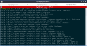
Chances are good that you can install Terminator with ease. It’s likely in your default repositories. For example, on Ubuntu you’d install it with this command:

Go ahead, give it a shot… If not immediately available, you can look here for more information. If you’re really energetic, you can read the documentation. In this case, it’s going to be a positive review (obviously), so I’d not recommend it (such as I am) if I wasn’t a fan… So…

Why Terminator:

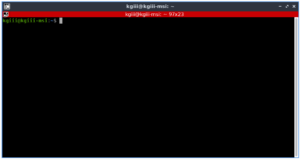
You’ll not be even remotely surprised when you open Terminator for the first time, and that’s a good thing. You’ll see your standard terminal looking thing, complete with a title bar. Truthfully, it’s kinda ugly looking until you make it your own (more on that in a minute). It looks like this:

terminator terminal emulator in its naked form
Terminal (terminal emulator) without any customizations.

What you’re looking for is in the right mouse-button click – the preferences menu. Once you open that, you’ll see all sorts of options.  

Once in the options, you’ll start to understand why I like Terminator. You can make it visually appealing, use multiple tabs, group tabs, auto-run commands when opened, and have all the various profiles you could possibly want. If you’re working on multiple servers at the same time, this is definitely a great help.

You have infinite theme options, but there are a number of them that are built in – the standard types like solarized dark or light. If I’m not taking screenshots, I like mine to look like this:

terminator with a thene
As I’m often in a dark room, this is excellent for my eyes.

That is so much nicer on my eyes. And, if the Terminator theme didn’t clue you in, yes I am using a computer that I don’t normally use. It’s a long story, but nothing is broken beyond my ‘net connection. But, that’s why the screenshots look different. I am also using Flameshot instead of my beloved Shutter.

So, that’s not enough? Seriously – go through and check the preferences. You have global options and then you have all sorts of preferences that you can pick – each contained in their own distinct profiles. When you get to the profiles, you’ll see how much customization is really possible. Allow me to show you:

terminator has options - lots of them
As you can see, there are a whole lot of options with Terminator.

What does Terminator offer? A whole lot… Not only are there tabs, you can set it up in a more traditional grid fashion. These layouts can be moved with drag-and-drop. The list of keyboard shortcuts is extensive – and you can probable tell I’m just reciting the documentation. Layouts are even saved from session to session.

But Wait, there’s more!

Anyhow, all those preferences, not just layouts, can be saved from session to session. Once you get it configured the way you want, it’ll let you retain those settings. Many of these are all extensions of the profiles feature, so it’s highly customized if you want it to be.

I especially like the individual profiles – not seen on this computer’s screenshot. If I paid a bit more attention, I could just copy the config from ~/.config/terminator, but I’m slacking and this situation is temporary. (I’m amazed that I’ve still been able to keep up my publication schedule!) I did not, so you get a different set of screenshots.

If you want, you can even find plugins for Terminator. You can write your own, if such is your desire. If you click here, you’ll see a bunch of plugins that you can use to extend Terminator even further. (Quite a few plugins exist, so do check the link.)

Note: I also wrote an article explaining how to change your default terminal.

As I said, there are quite a few plugins and some of them are quite useful – especially for system admins and programmers, or DevOps folks I guess. They’re universally free, in every sense of the word. They’re also easy to install – just drop them into ~/.config/terminator/plugins/ and they’ll be available to enable from the preferences menu.

If nothing else, go ahead and install Terminator to see if you like it. I dare say that you won’t be disappointed, unless you’ve got some weird edge-case and even then it’s about the best you’re going to get.

Rating Terminator:

Terminator does everything you can want in a terminal, more or less. If it doesn’t do what you want, plugins are easily developed and someone else may have scratched that itch for you already.

I honestly can’t think of anything it’s missing that I personally need or want. It can be a bit boxy and the look is dated, but it should match your theme fairly well, or better if you do some work customizing it.

I appreciate how easy it is to configure it to work with my eyesight. I’m partially colorblind (not the way you’re probably thinking) and have difficulties with the spaces between the primary colors. I can see green, but yellow-green may appear as either yellow or green to me. So, some of the themes (again, you can customize them as much as you desire) are wonderful for my eyes.

Yeah, try as I might, I just can’t think of anything bad to say about it. I’m reluctant to give anything a 10/10, but this is really close to being the perfect application for the task it is designed for. I’d even go so far as saying that it’s feature-complete, but some folks must not agree ’cause they keep writing plugins and that means they want more features.

So, I’m going to give this a 9.5 out of 10. That’s the highest I’ve ever rated anything on this site and I’d not expect to see that score for anything else. I knock the 0.5 because obviously people expect more from it – options they feel should be defaults. A few of the plugins are indeed handy (even to me, a simplistic user). Yeah, I’ll knock off the points for that. That sounds good. It gets a 9.5/10. That’s pretty much a gold medal winner, right there!

Closure:

And there you have it… You have another article – this one a review, and a review of not just one of my favorite pieces of software but of a piece of software I use many, many times a day. Even if you have a favorite terminal, give Terminator a try. You won’t be disappointed – probably… If you are, you’re just weird!

Thanks for reading! If you want to help, or if the site has helped you, you can donate, register to help, write an article, or buy inexpensive hosting to start your own site. If you scroll down, you can sign up for the newsletter, vote for the article, and comment.

Review: It Appears That uMatrix Is Back Under Development

This article is a bit of a review of some software called ‘uMatrix’. If you’ve never heard of it, it’s an impressive piece of software – especially considering it’s a browser extension.

I was nosing around some old projects in my GitHub when I decided to look upstream. Lo and behold, Ray Hill (gorhill of uBlock Origin fame) has picked up developing uMatrix again. (Install through your browser’s extension manager. Links below.)

What is uMatrix? GitHub page here.

Well, do you remember old school firewalls where you could not just block things by application, you could be even more refined – like narrowing it down to which port, ingress or egress, and even which domains that application could connect with?

Imagine something similar to that, except it’s for your browser. For each page, you can elect to block images, CSS, cookies, scripts. Then, you can decide which scripts and which CSS to allow through. You can elect which third party assets load, from cookies to images – and you can do so on a domain name basis.

There’s a learning curve. It’s a pretty big learning curve for a browser extension. Plan on a couple of hours to really get used to it – and to get your favorite sites configured. You need only configure them once and then you can backup the settings so that you can use it on multiple devices or put it aside for safekeeping. 

It WILL break sites. You WILL get frustrated.

More About uMatrix:

If I took privacy serious and were more security focused, I would not use the internet without uMatrix. As it stands, I have an older version (now updated) configured in one browser for when I want to visit stuff I absolutely don’t trust. If you take privacy serious (and cross-domain scripting, third party cookies are a huge no-no, but so shouldn’t images and CSS files) then you really, really should take a look at this extension.

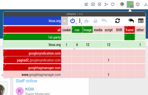
Take a look at this:

uMatrix in Opera.
Look a little daunting? You can figure it out. I have faith in you!

In each of those columns, you can click to block it everywhere or to allow it on this one specific domain. As you can see, there’s everything from cookies to CSS, from media to scripts. The refinement you can achieve is amazing. It will take some work and time for you to ‘get good’ with uMatrix.

Now, you basically want it to operate in the default configuration you have it in right after installing, only allowing CSS and images from the domain you’re visiting.

When a site refuses to work properly, you can start by allowing scripts on an individual basis – on the per-site basis you see from the domains listed on the left. You can click on two areas in each column to give fine-grained permissions. After a while, you can get pretty quick at deducing why it doesn’t work. It’s usually a script from another site that needs to be enabled.

You’ll also learn how much cruft the web has, browsing much faster and having fewer scripts chew up your CPU and RAM. If you have a low-end computer, this is also a must-have.

At one point, Hill had stopped working on the project and shuttered it. I’m not sure when he started working on it again. I’m glad they did because it’s the best privacy and security browser extension I’ve ever seen in my life. Now that he’s working on it again, I feel comfortable recommending it.

uMatrix Review:

Really, I wrote this to share my joy. If I had to review it, and I guess I have to, I’d give it a solid 9.5 out of 10. I’ve deducted a half point because there’s no effort to make it all that intuitive to new people and this makes the learning curve harder. It’s hard to explain, but once you see what it does you will understand it better.

Not even I can make it all that intuitive until you actually test it out and start browsing the web with it. If you get frustrated, settle down and relax. You can make it work. It will take some time to get used to the new paradigm. You can browse much faster (more so than from just blocking ads) when you’re not loading a bunch of 3rd party cruft.

You might as well know where to get it. It’s available for the two major browsers, plus in Opera’s own little extension store. These extensions work fine on same-family browsers, like Pale Moon or Google Chromium.

You can pick it up for Opera here.

Of course, you can pick it up for Firefox here.

And you can pick it up for Google Chrome here.

Give it a shot. Commit to browsing with it for a full day and see for yourself what the web is like when  you’re not loading tracking cookies, scripts, ad images loaded from other domain names, and so much more.

By the way…

I worried more about these things years ago, back when I was a Windows user and for the times when broadband wasn’t a realistic option. I was more concerned with my security and letting scripts load in the browser, so I’d use uMatrix. It had the added benefit of doing a great deal to protect my privacy by making it extremely difficult to track my movements across the web. These days, browsers are much more secure and run in their own containers and I care less about privacy.

Even just blocking remote scripts, media, and images will speed up your browsing noticeably. By the time you have it configured for the sites you visit, you’ll have a pretty secure and private browsing experience. You should also consider making it work in incognito mode if you make regular use of private browsing.

Closure:

There you have it, another article. This one is a review of uMatrix, one of my favorite browser extensions even though I don’t actually bother with it for most of my browsing. I used to browse with it exclusively, but I’ve given up caring. If you care, and many of my readers do, then I highly recommend trying it for a full day. Commit to a full day and then leave a comment telling us of your experiences.

Thanks for reading! If you want to help, or if the site has helped you, you can donate, register to help, write an article, or buy inexpensive hosting to start your own site. If you scroll down, you can sign up for the newsletter, vote for the article, and comment.

Review: MetaClean (Clean Exif/meta Data From Email Attachments Automatically)

Today’s article is about MetaClean, a Thunderbird plugin that you can use to automatically clean Exif (and other meta data) from email attachments. This is not the type of article I usually write, but it’s a very interesting extension for the Thunderbird email client. It’s good enough to help make folks aware of it.

Just the other day, I updated this article:

How To: Sanitize Exif Data From Your Digital Images For Privacy Sake

The update was largely a link that went to a study regarding the privacy implications of Exif data. If you’re unfamiliar with Exif data and its importance, I would strongly encourage you to read the article. I’d also strongly encourage you to read the linked article. If you’re concerned with your privacy, or are regulated to be concerned with the privacy of others, this might just be one of the best extensions you’ve ever used.

See, Exif data is just one type of meta data. Lots of files, from pictures to text documents, contain meta data. For example, a file generated by a rich text editor (such as LibreOffice) will contain your username, may contain a record of edits, and may contain a list of usernames that have also edited it. Meta data contains all that and more.

Enter MetaClean…

Note: MetaClean is a proprietary product with an enterprise/business solution that offer their services free for personal use. It’s a closed source product and using it means you trust them to perform the services claimed and adhere to their claims.

The file remains on the server for the time necessary for its processing, depending on the size of the file the processing time varies from 10 milliseconds to 600 milliseconds, after this time the file is removed and it will be impossible to restore it (GDPR compliant).

Read on to learn more about using MetaClean.

MetaClean Automatically Removes Meta Data:

It’s easy enough to add MetaClean to Thunderbird. Just click on Add-Ons and Themes, and then in the search box put “MetaClean.” The search result should contain the extension and you can install it with a single click. It’s remarkably easy.

MetaClean basically uploads all of your attachments to their own server, strips out the meta data (but will leave their own branding in the field, for free users) and then returns the sanitized file to your computer before the email actually sends. I tested this with a number of files and it’s amazingly fast.

Again, it requires that you trust them – and not care that they leave a comment in your meta data. The comment is harmless and won’t lead to you in any way. Your privacy will not be compromised.

Here’s the amazing thing, it not only does all that – but it even works on compressed files – though it only currently supports 7Zip and .zip formats. With them supporting Thunderbird (and it working fine on Linux), we can hope that they’ll expand that to .gz and some folks may like it if it could also work with .rar files. For now, it works just fine with the compressed files I tested.

Meta data is in all sorts of things that you create or touch, though it’s not always a bad thing. It’s sometimes useful to have meta data. I, for one, like to include the ID3 tags with my music files. But, you don’t always want to share the meta data. In fact, in some industries you have to not share it – to be compliant with privacy laws. However, if that’s you, you might be interested in their professional options – where the server that strips the meta data is actually owned and run by you.

Basically, once you’ve added it as an extension, it will automatically sanitize your files – removing any personal meta data from the file. It does this all without any user intervention (once you tell it to automatically do so). If you want to send a file while including the meta information you can also tell the plugin to let that email through with the personal information attached.

Closure:

It’s really that simple. Just install MetaClean and forget it. You won’t have to wonder if you remembered to sanitize your meta data before you sent it. You can be pretty confident that it was sent without that private data still attached. It’s definitely one of the most beneficial and easiest Thunderbird extensions that I’ve worked with lately.

I realize that I forgot to give it a number rating! In this case, it does what it says on the tin. I wish their privacy policy (while excellent) spelled it out a bit better. The tools could be a bit more fine-grained. They could see about adding support for more compression formats. As for the rest, they do great. I’m going to award them a solid 8 out of 10.

Thanks for reading! If you want to help, or if the site has helped you, you can donate, register to help, write an article, or buy inexpensive hosting to start your own site. If you scroll down, you can sign up for the newsletter, vote for the article, and comment.
Dooble Browser: A Review

Today, I’m going to review the Dooble browser, so that you don’t have to. The Dooble browser is a browser that has no dependencies as long as your system has fits ‘latest Qt is supported’ requirement. It bills itself as:

Dooble is the scientific browser.

Many folks are aware that I’m a sucker for a new browser. I install browsers that interest me, even though I have no plans to use them as my regular browser. I install browsers just to see what’s going on in the browser world. Changing my browser isn’t actually something I plan on doing!

So, I first read about Dooble browser when I was browsing Reddit. It was some video that I didn’t watch, ’cause I don’t tend click many video links. Seeing a browser name that I didn’t recognize sent me immediately to a search engine, where I found what was once their home page. That, sadly, wasn’t the project’s page anymore. It sent me here.

Technically, the link I clicked sent me straight to the release page where I found it packaged as a .deb file. Being who I am, I immediately downloaded it – with some glee, as it had been a little while since I played with a new browser. It said it was a scientific browser and I’m a mathematician, so I was pretty sure that the browser and I would get along famously.

I was wrong. Oh, was I wrong.

Installing Dooble Browser:

As mentioned, from the releases page, I found the .deb packaged for my Lubuntu system. It downloaded well enough, but the first thing I noticed was this:

Yes, yes that’s verbatim. I just copied and pasted the output. No, I have no idea why it started off with the selection process like that. I also have no idea why it’d go on to ‘getting’ files. The files were already there. The good news is that it did install and that it was immediately available in the application menu under the Internet heading.

Using Dooble Browser:

So, I opened up Dooble browser and was greeted with what looked like a fairly regular browser. I typed in the address for this site and the site opened, complete with ads.

Curious, I looked for a way to add extensions and found none – more on this later. So, I typed ‘Dooble browser ad block’ into the address bar and pressed the enter button.

Nothing happened.

At this point, I opened a few more sites and decided to open the settings menu. There are like 4 first-level tier buttons that will take you to your browser history… In the settings menu, I found search engines. None of them worked for searching from the address bar. Right clicking on text? Nope… There’s no active ‘search’ feature there.

I found an option to enable ‘web plugins’. This did not enable anything noticable.

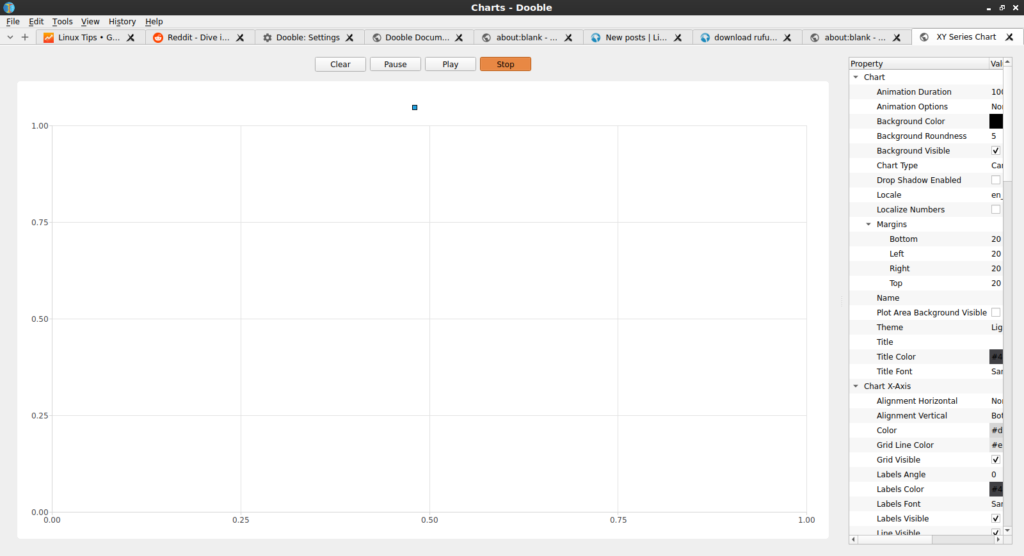
I decided to check out the ‘science’ aspect – which is just some sort of mystery graph. To do this, I clicked on ‘Charts’. It helpfully looks like this:

helpful charts from dooble browser
Yes, I pushed the buttons. No, it didn’t help. It wasn’t even remotely helpful.

I have no idea what they’re plotting on the chart. Pressing the buttons didn’t make it clear. I thought about investing some more time, but I don’t like throwing good time after bad.

In my effort to block ads, or at least to see if you could, I played with a feature that let me accept and block domains. I told it to only accept linux-tips.us, and refreshed. It still happily showed me ads from Google. Speaking of which, it’d be pretty sweet if you’d unblock ads on linux-tips.us!

Reviewing Dooble Browser:

Well, it does have an option for a floating clock and floating history. Oh, wait, there’s a 5th way to access history as a top-level option. They sure want you to be able to view your history.

I have no idea why it has ‘search engines’, because there’s no right click search menu and searching from the browser’s address bar does this:

Searching is not Dooble's strong point...
You can just keep clicking and waiting. Nothing happens… You can keep waiting…

Whatever it’s charting, I can’t tell. Usually an X and Y axis actually have labels. Without those, I can’t really tell what is going on. Is it me that’s making the mistakes? Once more, I can’t even tell!

Does it function as a browser? Well… You can technically browse sites. I browsed a number of them before giving up and noticed not one single rendering problem – which is a plus. I was able to login – but my username and password wasn’t remembered, meaning I couldn’t automatically log back in. 

One of the things I noticed was that the ‘cache size’ never increased – regardless of how much browsing was done. On the plus side, I told it to not allow Reddit to send push notifications and it appears to have remembered that.

So, on a scale of 1 to 10, I’m gonna give Dooble browser a solid 3.5. It stayed up and running, with no crashes. It didn’t require any dependencies, and installed cleanly. Technically, it does browse websites. The Gopher support amused me, though I didn’t bother testing it.

I find it laughable in its lack of functionality. That it has search features and then doesn’t let you search is amusing. I just can’t give it less than 3.5. I’m sure tons of hours are going into it, and I’ll assume that it’s going to improve. I’ll keep checking in on it. If you’re a developer and would like to offer some sort of rebuttal, I’m all ears. 

Closure:

Well… That’s a review. I don’t think I can recommend the Dooble browser to anyone at this time. They have lofty goals but are failing to meet them. When it becomes a usable browser, I’ll try to let people know. I’ll check in on it from time to time, even if just to get a chuckle from how laughably bad it is.

Thanks for reading! If you want to help, or if the site has helped you, you can donate, register to help, write an article, or buy inexpensive hosting to start your own site. If you scroll down, you can sign up for the newsletter, vote for the article, and comment.
Linux Tips
Creative Commons License
This work is licensed under a Creative Commons Attribution 4.0 International License.